
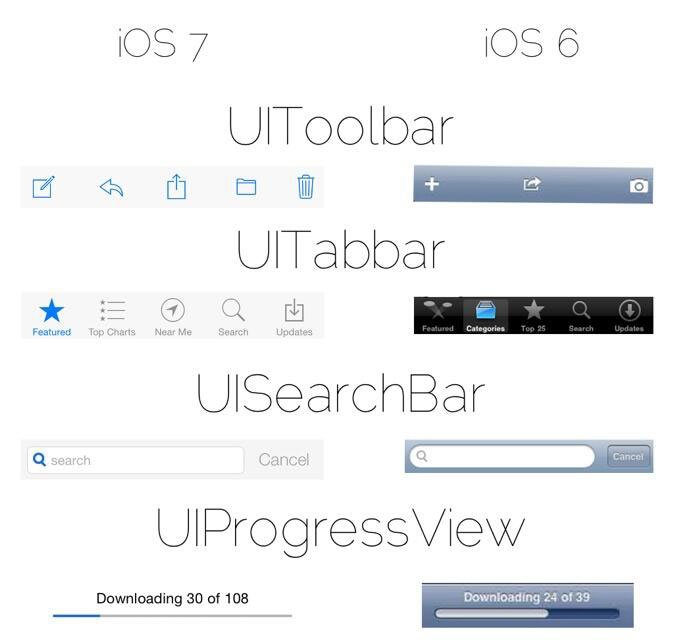
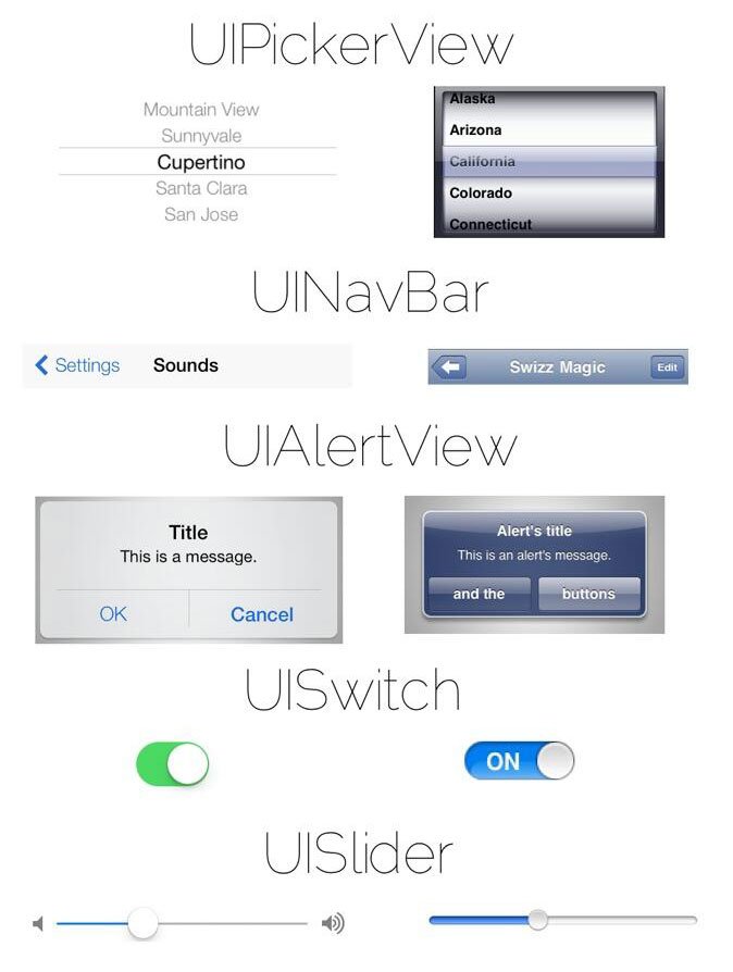
 Here’s an image preview of the upcoming new iOS 7. A side by side comparison to the current iOS 6 version. Love or hate it, it’s a matter of personal preferences. Apple moving away from the original design and more to Windows 8 like ‘flat’ interface. Stripping away a lot of the textures, gradients and glossy looks.
You can see the difference between the two iOS’s below.
![]()
![]()
Source: iJailbreak | @pawsupforu | Latest iPhone unlock with one click

Related Articles
- The Greatest Threat to Smartphone Security: Your 6-Year-Old? (allstate.com)
